
Selecting the right picture frame matboard colors can transform any artwork or photograph from ordinary to extraordinary. Modern interior design emphasizes clean lines, sophisticated color palettes, and thoughtful presentation, making the choice of matboard crucial for achieving that contemporary aesthetic. Whether you're framing family photos, artwork, or professional photography, understanding which picture frame matboard colors work best in modern spaces will elevate your entire decor scheme.
Modern decorating trends favor minimalism, neutral tones, and strategic color accents that complement rather than overwhelm the space. The right picture frame matboard serves as a bridge between your artwork and the surrounding environment, creating visual harmony while drawing attention to the framed piece. Professional interior designers consistently recommend specific matboard colors that align with contemporary design principles and enhance the overall aesthetic appeal of any room.
Understanding Modern Color Psychology in Matboard Selection
Neutral Foundations for Contemporary Spaces
Modern interior design relies heavily on neutral color foundations, and your picture frame matboard should complement this approach. Neutral matboards create a sophisticated backdrop that allows artwork to take center stage without competing for attention. These colors work exceptionally well in minimalist spaces where every design element serves a specific purpose and contributes to the overall aesthetic harmony.
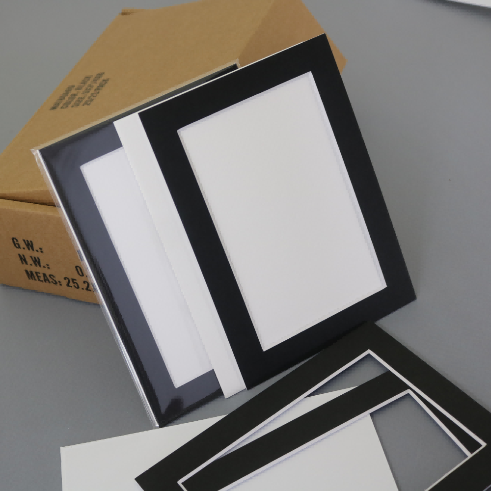
White and off-white picture frame matboard options remain the most popular choices for modern decor because they provide clean, crisp presentation that works with virtually any color scheme. These neutral tones create breathing space around artwork, making pieces appear larger and more impactful. The versatility of neutral matboards makes them ideal for gallery walls and rotating artwork displays.
Color Temperature and Visual Impact
Understanding color temperature is essential when selecting picture frame matboard for modern spaces. Cool-toned matboards in grays, blues, and whites create a contemporary, sophisticated atmosphere that aligns with modern design principles. These colors tend to recede visually, allowing the framed artwork to command attention while maintaining the clean aesthetic that defines contemporary interiors.
Warm-toned matboards, while less common in ultra-modern spaces, can add subtle richness and depth when used strategically. The key is choosing warm tones that maintain the sophisticated, uncluttered look that characterizes modern decor. Professional framers often recommend limiting warm-toned picture frame matboard to specific accent pieces rather than using them throughout an entire gallery wall.
Top Classic Colors for Modern Picture Frame Matboard
Pure White and Bright White Options
Pure white picture frame matboard remains the gold standard for modern framing applications. This classic choice provides maximum contrast for dark artwork while maintaining a clean, gallery-like presentation that works in any contemporary setting. Pure white matboards reflect light effectively, making artwork appear more vibrant and helping smaller pieces command attention in larger spaces.
Bright white variations offer slightly different undertones that can be matched to specific lighting conditions or existing decor elements. Museum-quality bright white matboards provide archival protection while delivering the crisp, professional appearance that modern homeowners desire. These options work particularly well with black and white photography, creating striking contrast that enhances the visual impact.
Sophisticated Gray Variations
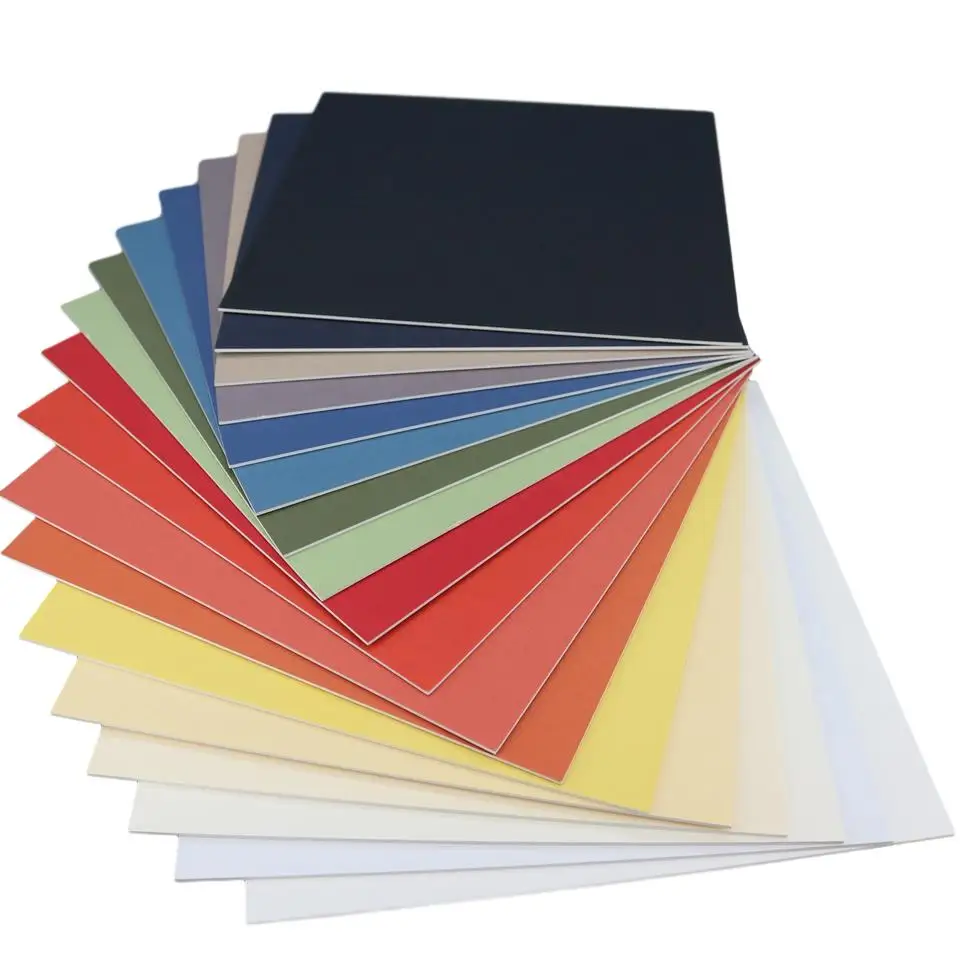
Gray picture frame matboard has become increasingly popular in modern interior design due to its sophisticated, neutral appearance that complements contemporary color schemes. Light gray options provide subtle contrast without the stark appearance of pure white, making them ideal for delicate artwork or photographs with softer tones. These sophisticated neutrals work exceptionally well in modern living spaces where balance and restraint are paramount.
Medium and charcoal gray matboards offer more dramatic presentation options while maintaining the sophisticated aesthetic required for modern decor. These deeper tones can make lighter artwork pop while providing elegant contrast that enhances the overall visual impact. Gray variations work particularly well with metallic frames and contemporary furniture pieces.
Contemporary Color Trends in Modern Matboard Design
Minimalist Black for Maximum Impact
Black picture frame matboard creates dramatic, high-contrast presentation that works exceptionally well in modern, minimalist spaces. This bold choice requires careful consideration of the artwork and surrounding decor, but when used appropriately, black matboards can create stunning visual impact that elevates the entire presentation. Modern galleries frequently use black matboards for contemporary artwork and high-contrast photography.
The sophistication of black matboards makes them ideal for creating focal points in modern interiors. When paired with sleek frames and strategic lighting, black picture frame matboard can transform ordinary artwork into museum-quality presentations. This approach works particularly well in spaces with neutral walls and contemporary furniture where dramatic accents are needed to create visual interest.
Subtle Cream and Ivory Alternatives
Cream and ivory picture frame matboard options provide warmth while maintaining the clean aesthetic required for modern decor. These subtle alternatives to pure white work exceptionally well with vintage photography, botanical prints, and artwork that benefits from slightly warmer presentation. The understated elegance of cream matboards complements modern farmhouse and transitional design styles.
Professional interior designers often recommend ivory matboards for spaces that might feel too stark with pure white options. These warmer neutrals create inviting atmosphere while preserving the sophisticated, uncluttered look that defines contemporary interior design. Picture frame matboard in cream tones works particularly well with natural wood frames and organic design elements.
Strategic Color Accents for Modern Spaces
Navy Blue for Sophisticated Contrast
Navy blue picture frame matboard offers sophisticated color that works beautifully in modern spaces without overwhelming the design scheme. This classic color provides rich contrast for lighter artwork while maintaining the refined appearance that contemporary interiors require. Navy matboards work particularly well with nautical themes, architectural photography, and abstract artwork in complementary colors.
The versatility of navy blue makes it an excellent choice for accent pieces in modern gallery walls. When used sparingly among neutral matboards, navy can create visual rhythm and interest without disrupting the overall aesthetic harmony. This strategic approach allows homeowners to incorporate color while maintaining the sophisticated, curated appearance that defines modern interior design.
Sage Green for Natural Modern Appeal
Sage green picture frame matboard has emerged as a popular choice for modern interiors that incorporate natural elements and biophilic design principles. This muted, sophisticated green works exceptionally well with botanical photography, landscape artwork, and pieces that celebrate natural themes. The calming quality of sage green matboards complements modern spaces that prioritize wellness and connection to nature.
Modern farmhouse and Scandinavian-inspired interiors often feature sage green accents, making this matboard color an ideal choice for maintaining design continuity. The subtle, organic quality of sage green picture frame matboard provides visual interest without compromising the clean, uncluttered aesthetic that characterizes contemporary design. This color works particularly well with white and natural wood frames.
Professional Installation and Presentation Tips
Gallery Wall Coordination Strategies
Creating cohesive gallery walls requires careful coordination of picture frame matboard colors to achieve professional, museum-quality presentation. Modern gallery walls typically feature a limited color palette with strategic variation to create visual interest without overwhelming the space. Professional designers recommend using no more than two or three matboard colors within a single gallery wall arrangement.
The key to successful gallery wall design lies in balancing neutral picture frame matboard options with occasional accent colors that complement the overall room design. White and light gray matboards should dominate the arrangement, with darker or colored options used sparingly to create focal points and visual rhythm. This approach ensures that individual pieces stand out while contributing to a cohesive, sophisticated presentation.
Lighting Considerations for Matboard Selection
Lighting conditions significantly impact how picture frame matboard colors appear in modern interiors. Natural lighting tends to reveal the true colors of matboards, while artificial lighting can shift color perception and create unwanted color casts. Professional framers recommend evaluating matboard samples under the same lighting conditions where the finished pieces will be displayed.
Modern track lighting and picture lights can enhance the presentation of carefully selected matboards, but they can also highlight color inconsistencies or poor quality materials. High-quality picture frame matboard materials maintain color consistency under various lighting conditions, making them essential for achieving the professional appearance that modern interiors demand. Consider the direction and intensity of both natural and artificial light when making final matboard selections.
Quality Considerations for Modern Matboard Applications
Archival Materials for Long-term Preservation
Modern picture frame matboard selection should prioritize archival quality materials that provide long-term protection for valuable artwork and photographs. Acid-free, lignin-free matboards prevent yellowing and deterioration that can compromise both the artwork and the aesthetic appeal over time. These professional-grade materials maintain their appearance and protective qualities for decades, making them essential for modern homes where artwork represents significant investment.
Conservation-grade picture frame matboard options offer superior protection while maintaining the color consistency that modern interiors require. These premium materials resist fading, discoloration, and environmental damage that can affect lower-quality alternatives. The investment in high-quality matboards pays dividends in terms of both preservation and long-term aesthetic appeal.
Texture and Finish Options
Modern matboard applications benefit from subtle texture variations that add visual interest without overwhelming the clean aesthetic. Smooth, museum-quality finishes work best for contemporary presentations, while subtle linen or canvas textures can add sophistication to specific applications. The key is choosing textures that enhance rather than distract from the framed artwork.
Matte finishes remain the standard for modern picture frame matboard applications because they eliminate glare and provide consistent appearance under various lighting conditions. Glossy or reflective finishes should be avoided in contemporary settings as they can create unwanted reflections and detract from the artwork itself. The goal is to create seamless presentation that allows the artwork to take center stage.
FAQ
What is the most versatile picture frame matboard color for modern decor
Pure white picture frame matboard remains the most versatile choice for modern decor because it complements any color scheme, enhances artwork visibility, and creates the clean, sophisticated appearance that defines contemporary interior design. White matboards work with both colorful and monochromatic artwork while maintaining the minimalist aesthetic that modern homeowners prefer.
How many different matboard colors should I use in a gallery wall
Professional designers recommend limiting gallery walls to two or three picture frame matboard colors maximum to maintain the cohesive, sophisticated appearance that modern interiors require. The majority should be neutral colors like white or light gray, with one accent color used sparingly to create visual interest and focal points throughout the arrangement.
Can colored matboards work in minimalist modern spaces
Colored picture frame matboard can work in minimalist modern spaces when used strategically and sparingly. Sophisticated colors like navy blue, sage green, or charcoal gray can enhance specific pieces without overwhelming the clean aesthetic. The key is choosing muted, sophisticated tones rather than bright or saturated colors that would conflict with minimalist design principles.
How do I choose matboard colors that will remain stylish over time
Choose classic picture frame matboard colors like white, cream, light gray, and black for timeless appeal that transcends decorating trends. These neutral options provide flexibility for changing artwork and decor while maintaining the sophisticated presentation that never goes out of style. Avoid trendy colors that may look dated as design preferences evolve over time.
Table of Contents
- Understanding Modern Color Psychology in Matboard Selection
- Top Classic Colors for Modern Picture Frame Matboard
- Contemporary Color Trends in Modern Matboard Design
- Strategic Color Accents for Modern Spaces
- Professional Installation and Presentation Tips
- Quality Considerations for Modern Matboard Applications
- FAQ