
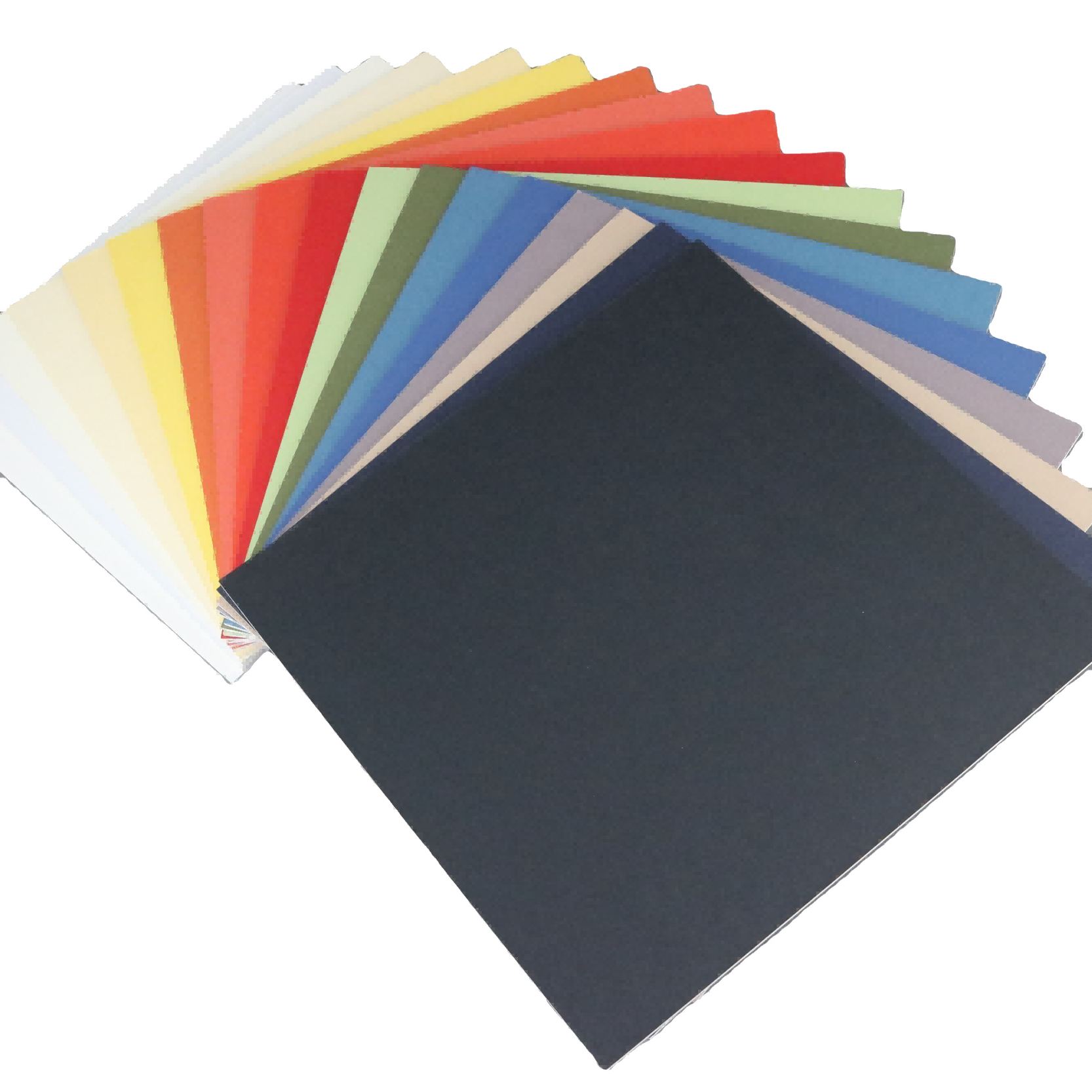
Selecting the perfect precut matboard color can dramatically transform your artwork presentation and elevate the visual impact of any framed piece. Professional framers and art enthusiasts understand that the right matboard creates a harmonious bridge between the artwork and its surrounding environment, enhancing colors while providing essential protection. Quality precut matboard serves both aesthetic and preservation purposes, offering a cost-effective solution for displaying photographs, prints, and original artwork with museum-quality results.
Understanding Color Theory in Matboard Selection
Warm Versus Cool Color Palettes
The fundamental distinction between warm and cool colors plays a crucial role in precut matboard selection for optimal art presentation. Warm colors including cream, ivory, beige, and soft yellows create an inviting atmosphere that complements earth-toned artwork, vintage photographs, and traditional oil paintings. These warmer precut matboard options tend to advance visually, making artwork appear closer and more intimate to viewers.
Cool colors such as pure white, light gray, and subtle blues provide a clean, contemporary backdrop that enhances modern photography, abstract art, and high-contrast black and white images. Cool-toned precut matboard creates visual distance and allows vibrant artwork colors to pop dramatically against the neutral background. Understanding this color temperature relationship ensures your matboard choice enhances rather than competes with your artwork's natural color harmony.
Complementary Color Relationships
Advanced color theory principles guide sophisticated precut matboard selection for professional-quality results. Complementary colors sit opposite each other on the color wheel and create dynamic visual tension when used strategically in matting applications. For instance, selecting a subtle green-tinted precut matboard can enhance red elements in artwork, while soft purple undertones complement yellow-dominant pieces.
Analogous color schemes using colors adjacent on the color wheel create harmonious, soothing presentations perfect for residential and commercial spaces. A photographer displaying seascape images might choose blue-gray precut matboard to echo the ocean tones, creating a cohesive visual narrative that draws viewers deeper into the composition. These sophisticated color relationships separate amateur framing attempts from professional-quality presentations.
Popular Precut Matboard Color Categories
Classic Neutral Options
Pure white remains the most versatile and popular choice among professional framers for its ability to complement virtually any artwork style or color palette. White precut matboard provides maximum contrast for darker images while maintaining clean, gallery-worthy presentation standards. Museum curators frequently select white matting for its timeless appeal and ability to focus viewer attention directly on the artwork without distraction.
Cream and off-white variations offer subtle warmth while maintaining the clean appearance that makes white so universally appealing. These softer neutral tones prevent the stark contrast that pure white sometimes creates with delicate watercolors or vintage photographs. Natural white and antique white precut matboard options provide sophisticated alternatives that work beautifully in traditional and transitional interior design schemes.
Contemporary Gray Selections
Gray precut matboard has gained significant popularity in modern framing applications due to its sophisticated neutrality and contemporary appeal. Light gray options provide subtle depth without overwhelming delicate artwork, while charcoal and darker grays create dramatic contrast perfect for bold, colorful pieces. The versatility of gray precut matboard makes it an excellent choice for photographers and artists working in monochromatic or limited color palettes.
Professional interior designers frequently specify gray matting for its ability to bridge the gap between stark white walls and darker furniture pieces. Medium gray precut matboard creates visual continuity in gallery walls featuring multiple artworks, providing consistency while allowing individual pieces to maintain their unique character. This color family works exceptionally well in minimalist and industrial interior design styles where clean lines and neutral palettes predominate.
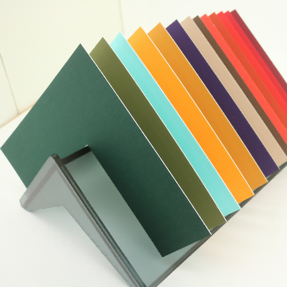
Specialized Color Applications
Earth Tone Selections
Warm earth tones including tan, beige, and soft brown create intimate, welcoming presentations perfect for landscape photography, botanical prints, and rustic artwork themes. These precut matboard colors work particularly well in traditional homes, cabins, and spaces where natural materials and warm color schemes predominate. The organic feel of earth-toned matting creates psychological comfort and visual warmth that enhances viewer connection with nature-themed artwork.
Sage green and muted olive tones represent sophisticated earth color options that complement outdoor photography and environmental artwork beautifully. These subtle color choices provide enough visual interest to enhance the artwork while maintaining the neutral qualities essential for professional presentation. Earth-toned precut matboard selections work exceptionally well for artists and photographers specializing in natural subjects and organic themes.
Bold Color Statements
While neutral colors dominate professional framing, strategic use of bolder precut matboard colors can create stunning artistic statements when applied thoughtfully. Deep navy blue matting enhances nautical themes and creates sophisticated contrast with gold-toned artwork or warm sunset photography. Rich burgundy or forest green options work beautifully with traditional portraiture and classical artwork reproductions.
Contemporary artists sometimes employ vibrant matboard colors as integral design elements rather than mere background support. Bright red precut matboard might enhance a modern abstract piece, while electric blue could complement futuristic digital artwork. However, these bold choices require careful consideration of the viewing environment and long-term aesthetic appeal to ensure the matboard enhances rather than overwhelms the primary artwork.
Technical Considerations for Color Selection
Lighting Impact on Color Perception
The lighting conditions where artwork will be displayed significantly influence optimal precut matboard color selection for best visual results. Natural daylight reveals true colors most accurately, but most indoor spaces rely on artificial lighting that can shift color perception dramatically. Warm incandescent lighting enhances cream and beige matboard tones while potentially making pure white appear yellowish or dingy.
LED and fluorescent lighting tends to emphasize cooler tones, making white and gray precut matboard appear crisp and clean while potentially washing out warmer earth tones. Professional framers often recommend viewing matboard samples under the actual lighting conditions where the artwork will hang to ensure color accuracy and visual harmony. This attention to environmental factors separates amateur framing decisions from professional-quality results.
Archival Quality and Color Stability
Premium precut matboard maintains color consistency over decades when manufactured with archival-quality materials and proper pH buffering. Acid-free construction prevents yellowing and discoloration that can compromise both the matboard appearance and artwork preservation. Museum-quality precut matboard uses lightfast colorants that resist fading even under prolonged exposure to gallery lighting conditions.
Conservation-grade materials ensure that your carefully selected matboard color remains stable throughout the artwork's display lifetime. Cheaper alternatives may initially match your desired color but can shift dramatically over months or years, requiring costly replacement and potential artwork damage. Investing in quality precut matboard with proven color stability protects both your aesthetic vision and valuable artwork investment for generations.
Professional Installation and Display Tips
Multiple Mat Combinations
Sophisticated framing often employs multiple precut matboard layers to create visual depth and enhanced presentation impact. A popular technique combines a wider neutral outer mat with a narrower colored inner mat that echoes artwork tones. This approach allows for subtle color introduction while maintaining the clean, professional appearance that neutral matting provides.
Double and triple matting using various precut matboard colors creates dimensional layering that adds perceived value and gallery-quality sophistication to any artwork. The outer mat typically uses neutral colors like white or cream, while inner mats might incorporate complementary colors or tones found within the artwork itself. This layered approach works particularly well for valuable photographs and limited edition prints where enhanced presentation justifies additional investment.
Frame and Room Coordination
Successful precut matboard selection considers the frame style, room decor, and architectural elements to create cohesive visual harmony. Traditional wooden frames pair beautifully with warm cream or off-white matting, while sleek metal frames often work best with pure white or gray options. The matboard should bridge the visual gap between artwork and frame while complementing the room's overall color scheme.
Contemporary interior design often employs consistent matboard colors throughout multiple pieces to create gallery wall coherence. This approach allows diverse artworks to work together harmoniously while maintaining individual character and appeal. Professional designers frequently use identical precut matboard colors across various frame sizes and artwork types to achieve sophisticated, curated appearance in residential and commercial spaces.
FAQ
What is the most versatile precut matboard color for beginners?
Pure white precut matboard offers the greatest versatility for beginners because it complements virtually any artwork style, color palette, or room decor. White matting provides clean, professional presentation while allowing artwork colors to appear vibrant and true. This neutral choice works equally well with photographs, prints, watercolors, and digital art, making it an excellent starting point for those new to custom framing.
How do I choose between warm and cool matboard tones?
Consider your artwork's dominant colors and the room's lighting conditions when selecting between warm and cool precut matboard tones. Artwork with warm colors like reds, oranges, and yellows typically pairs well with cream or off-white matting, while cool-toned pieces featuring blues, greens, and purples work beautifully with pure white or light gray options. Room lighting also influences this decision, as warm artificial lighting enhances cream tones while cool LED lighting makes white matting appear crisp and clean.
Can I use colored precut matboard for professional presentations?
Colored precut matboard can enhance professional presentations when selected thoughtfully and applied strategically. Subtle earth tones like sage green or soft gray work well in professional environments, while bolder colors should be reserved for specific artistic effects or themed displays. The key is ensuring the colored matting enhances rather than competes with the artwork, maintaining focus on the primary piece while adding sophisticated visual interest.
How does matboard color affect artwork value perception?
Quality precut matboard selection significantly influences perceived artwork value and professionalism. Neutral colors like white, cream, and light gray typically enhance perceived value by creating clean, museum-quality presentation standards. Poor color choices or low-quality materials can diminish artwork impact and suggest amateur presentation. Professional-grade matboard with appropriate color selection demonstrates respect for the artwork and enhances its investment potential in collector and commercial markets.