
The Essential Guide to Selecting Perfect Frame Mounting Colors
The art of choosing the right mount board can transform an ordinary piece of artwork into a stunning masterpiece. When it comes to framing and presenting artwork, the mount board serves as more than just a protective barrier - it's an integral design element that can enhance or diminish the overall visual impact of your piece. Understanding how to select the perfect mount board color requires careful consideration of various factors, from the artwork's color palette to the intended display environment.
Professional framers and art enthusiasts alike recognize that the mount board choice can make the difference between a mediocre presentation and one that truly captivates viewers. The right selection creates harmony between the artwork and its surroundings, while an inappropriate choice might distract from the piece itself. Let's explore the intricate world of mount board selection and discover how to make choices that will elevate your artwork to new heights.
Understanding Mount Board Fundamentals
Types and Qualities of Mount Boards
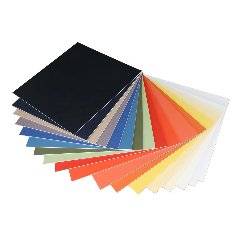
Before diving into color selection, it's crucial to understand the different types of mount boards available in the market. Conservation-grade mount board offers superior protection against acid deterioration and is ideal for valuable artwork. Standard mount board, while more economical, might be suitable for temporary displays or less valuable pieces. The texture and finish of the mount board also play essential roles in the overall presentation, with options ranging from smooth to subtly textured surfaces.
The thickness of mount board can vary significantly, typically from 1.4mm to 3.0mm, with each serving different purposes. Thicker boards provide more depth and stability, while thinner ones might be preferred for simpler presentations. The core color of the mount board becomes visible at beveled edges, adding another dimension to consider in your design choices.
The Impact of Color Psychology
Color psychology plays a vital role in mount board selection. Warm colors like cream and off-white can create an inviting, comfortable atmosphere, while cool whites might deliver a more contemporary, gallery-like feel. Understanding these psychological effects helps in making informed decisions that complement both the artwork and its intended display environment.
The emotional response to different mount board colors can significantly influence how viewers perceive the artwork. For instance, a deep charcoal mount board might add drama and sophistication to black and white photographs, while a soft cream board could enhance the warmth of traditional oil paintings.
Color Selection Strategies
Matching Artwork Elements
When selecting mount board colors, consider pulling subtle tones directly from the artwork itself. This technique creates a harmonious connection between the piece and its presentation. Look for secondary or tertiary colors within the artwork that might not be immediately obvious but could provide perfect mounting options.
For photographs, consider the dominant tones and whether you want to enhance or contrast with them. A mount board that matches subtle highlights in a black and white photograph can create an elegant, cohesive look, while a contrasting color might make the image pop more dramatically.
Environmental Considerations
The display environment plays a crucial role in mount board selection. Consider the wall color, room lighting, and surrounding décor when choosing your mount board. Natural lighting can affect how colors appear throughout the day, so it's worth testing samples in the intended display location before making a final decision.
Modern interiors might benefit from crisp, contemporary mount board choices, while traditional settings might call for warmer, more classic options. The size of the room and viewing distance should also influence your color selection, as these factors affect how the mounted artwork will be perceived.
Advanced Mounting Techniques
Multi-layered Mounting
Creating depth and visual interest through multi-layered mounting involves carefully selecting complementary mount board colors. This technique can add sophistication to your presentation while drawing attention to specific aspects of the artwork. The key is to maintain balance and ensure that the mounting enhances rather than competes with the piece.
When working with multiple layers, consider using subtle variations in color or tone to create depth. This might involve selecting a slightly darker or lighter shade for each layer, creating a sophisticated, dimensional effect that draws the eye inward toward the artwork.
Special Effect Mounting
Contemporary mounting techniques often incorporate specialized mount board materials and effects. Metallic finishes, textured surfaces, and unique color combinations can add extra dimension to your presentation. However, these effects should be used judiciously to avoid overwhelming the artwork itself.
Experimental approaches with mount board can lead to striking results when executed thoughtfully. Consider how different textures and finishes might interact with your artwork and the viewing environment, always keeping the primary focus on enhancing rather than distracting from the piece.
Frequently Asked Questions
How does lighting affect mount board color selection?
Lighting plays a crucial role in how mount board colors appear. Natural daylight will show colors most accurately, while artificial lighting can significantly alter their appearance. It's recommended to test mount board samples under the same lighting conditions where the artwork will be displayed to ensure the desired effect is achieved.
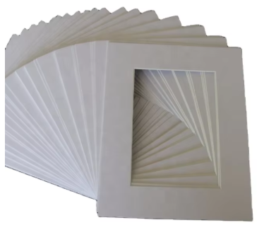
What is the best mount board color for conservation purposes?
For conservation purposes, natural white or off-white mount boards are typically recommended as they're usually free from dyes that might affect the artwork over time. However, conservation-grade mount boards are now available in various colors that are safe for long-term use with valuable artwork.
Can I use colored mount board for historical photographs?
While it's possible to use colored mount board for historical photographs, conservation considerations should come first. Neutral tones are traditionally preferred as they don't compete with the historical nature of the images. If using colored mount board, ensure it's conservation-grade to protect the photograph from potential damage over time.
How do I choose mount board colors for abstract art?
For abstract art, consider the overall mood and color palette of the piece rather than trying to match specific elements. Look for mount board colors that complement the artwork's dominant tones while allowing the piece's energy and movement to remain the focal point. Sometimes, a neutral mount board can provide the perfect backdrop for complex abstract compositions.